The challenge
The 2006–07 season was a milestone year for the Ottawa 67's. The club was celebrating its 40th anniversary, and the same season marked head coach Brian Kilrea’s 30th season in charge. Kilrea is a coaching legend in Ottawa and the winningest coach in Canadian major-junior history.
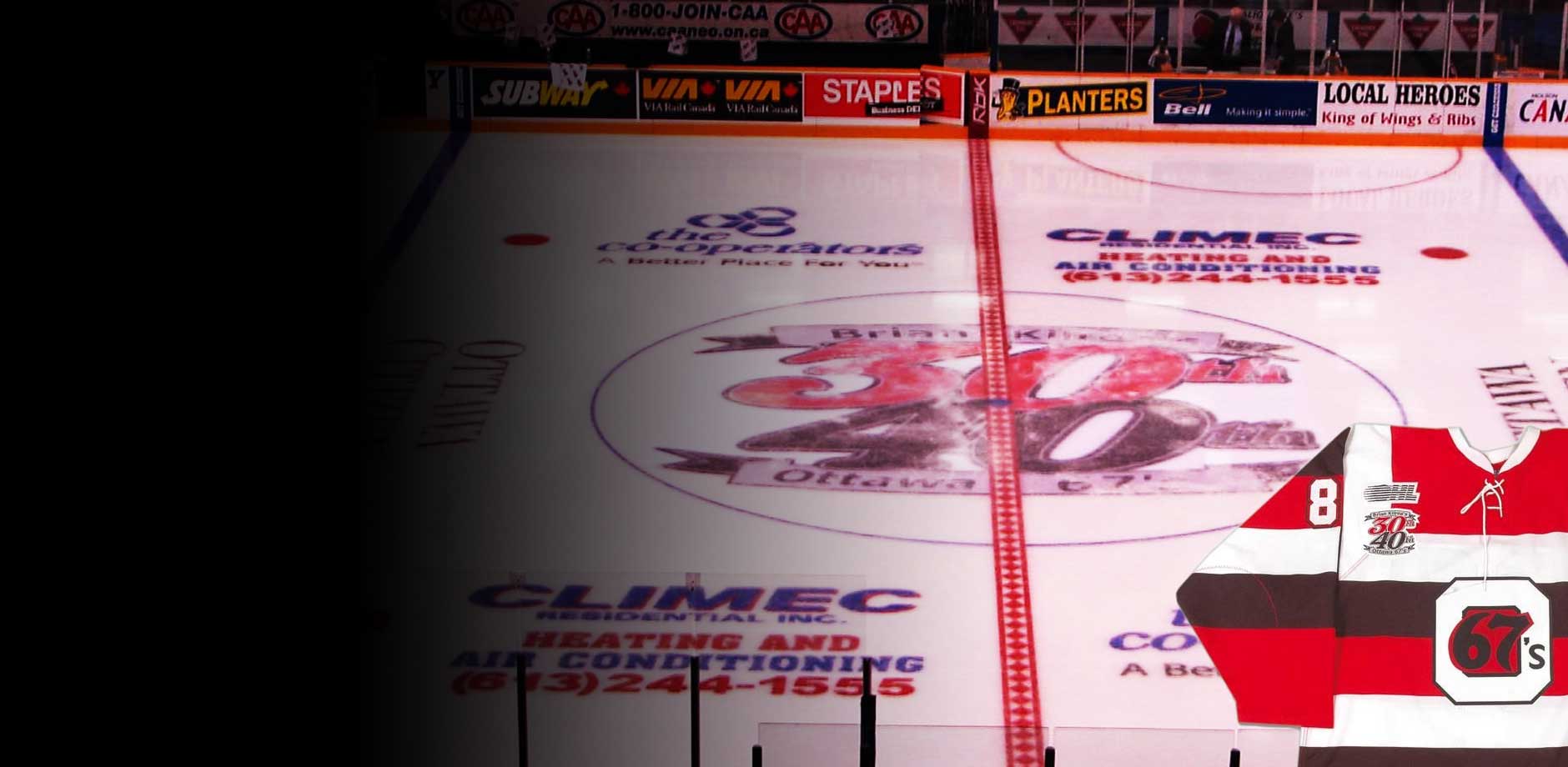
The team needed one anniversary mark that honoured both milestones without competing with the club’s primary logo. It also had to work everywhere the season would be seen: painted at centre ice, embroidered on game jerseys, printed across marketing material and shown on television broadcasts.
What we did
2DW designed the 40th anniversary logo as a single, self-contained mark that tells the story of both anniversaries at a glance.
Because the logo had to perform at very different scales and in very different media, it was built with production in mind from the start:
Centre ice: bold shapes and clear contrast that read from the upper rows of the arena and on wide TV shots.
Jerseys: a limited palette and clean edges suited to embroidery, with no fine detail that would be lost in thread.
Marketing and broadcast: artwork versions for print, signage, digital and on-screen graphics, so the mark looked consistent wherever fans saw it.
The results
The anniversary logo became the visual signature of the 2006–07 season. Fans saw it at centre ice every home game, on the players’ jerseys, throughout the season’s marketing and on television, all in a season remembered for Kilrea’s milestones.
It is a good example of how 2DW approaches identity work: a strong idea, designed from the outset to hold up in every place it will appear.